Humorfy
Humorfy, a groundbreaking health and wellness app, approached our team with a unique vision:
Create a mobile application that seamlessly blends mental health, well-being, and humor through gamification, journaling, and humorous elements.
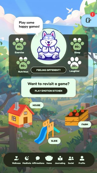
The app aimed to cater to a broad demographic, spanning ages 18 to 45, by integrating humor and games into daily health routines, making mental health practices more engaging and accessible. Incorporating characters like the Humor Husky and a range of mini-games and activities based on a "Hero's Journey" narrative. All are designed to help users manage their emotions and adopt healthier habits in an engaging and playful way.
Humorfy Team
Client
Humorfy
Project Managers
Jaden Bhang, Justin Lau, Tyler Hset Hlaing (in-training, not pictured)
UX Designers
Meilan Wong, Adrienne Liang, Ava Zhu, Jessica Yu, Kaia Kim
Cal Poly Iter8 Winter 2024
My Role?
UX Designer / Researcher + visual design, design systems, prototyping, user testing
UX Designer for the following:
User Profiles (including the Activity, Community, and Resources tab), ‘Edit Profile’ functions, ‘Connecting with Community’ functions, and App Settings.
Problem Statement
How might I create a mobile app that helps Gen Z and millennial users manage stress, anxiety and other mental health challenges in an engaging, gamified and humorous way that keeps them motivated to build positive habits?
The primary challenge was to design an app that appeals to a wide age range while balancing whimsical, Pixar-like visuals with the maturity needed to engage adults. The app needed to seamlessly integrate health tracking with humorous elements without overwhelming or alienating users.
Mental health is a serious topic that often carries a stigma, making it difficult for many individuals to seek help or engage in practices that promote well-being. Creating an app prototype for Humorfy presented the challenge of designing an engaging and inclusive platform that addresses these stigmas while catering to a broad demographic spectrum. Furthermore, seamlessly integrating health tracking features with humorous elements without overwhelming or alienating users posed a significant design hurdle.
Client Standups
During our initial meetings, the client emphasized the importance of:
Pixar-like animation, rounded design elements, and a vibrant yet sophisticated color palette. They desired a design that was not overly feminine, with a strong preference against orange and for more customizable color schemes. The client's vision was clear: a health tracker that felt like a playful yet practical companion in the user's journey towards wellness and better mental health.
Key Insights from these meetings included:
Target Audience Gen Z and Millennials experiencing stress, with a preference for engaging game elements.
Design Preferences Rounded buttons, vibrant colors (particularly purples and greens), and a Pixar-like visual appeal.
Functional Expectations Avatar-based health tracking, integration with smartwatches, and interactive elements—characters providing health tips.
Research
Before diving into the prototype design, we conducted user research to better understand the needs and frustrations of our target audience. Each team member interviewed 2-3 different people to gather insights on their experiences with mental health apps, their preferences for gamification, and their expectations for a humor-infused health tracker.
The research revealed that many users found existing mental health apps to be dull, repetitive, and lacking in engagement. They expressed a desire for a more interactive and entertaining approach to managing their well-being. Users also emphasized the importance of personalization, wanting the app to feel tailored to their individual needs and preferences.
Conducted user interviews to understand the needs and expectations of potential users. Created user personas to better understand our audience interests and needs.
Harnessing the Power of User Insights
Our research phase yielded several critical insights that directly shaped the design and direction of Humorfy. Key takeaways included:
The Craving for Customization Users expressed a strong desire for a personalized experience. They wanted the ability to tailor the interface to their preferences, including color schemes, character selection, and the types of games and activities offered. This finding emphasized the importance of implementing robust customization features within the app.
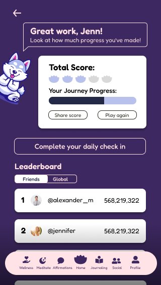
Community as a Catalyst Many users indicated a desire for connection and a sense of community within a mental health app. They envisioned features promoting social interaction, such as shared challenges, leaderboards, and forums where they could connect with like-minded individuals. This highlighted the need to explore ways to foster a supportive and engaging social environment within the app.
Addressing Varying Preferences Users had diverse preferences when it came to humor and visual themes. While some embraced the whimsy and playful elements, others expressed a preference for a more toned-down and refined aesthetic. This insight guided us in developing a range of themes and customization options, ensuring to appeal to a diverse target audience.
Insights gleaned from user research directly informed several key design decisions:
Flexible Customization We implemented a robust system allowing users to fine-tune their experience – from selecting color schemes to choosing from a library of avatars and characters. This empowers users to create a version of Humorfy that aligns with their unique preferences.
Community-Centric Features We incorporated elements such as leaderboards and challenges to foster a sense of friendly competition and shared goals, along with discussion forums and groups to facilitate social connection among users.
Adaptive Aesthetics To cater to a diverse range of preferences, we developed alternative themes and visual styles. These could range from the playful and whimsical to more sophisticated and subdued, ensuring that the app resonates with users of varying tastes.
Translating Insights into Design
AI Midjourney
Utilized AI tools like Midjourney to speed up the process:
• These were widely used during client meetings
• The client would be greeted with an AI generated mockup to specifically understand the client’s taste, giving us a better idea of what the client wanted with easy modification to the AI mockup
Ideation and Design System
Our design decisions focused on creating a positive and calming experience for users.
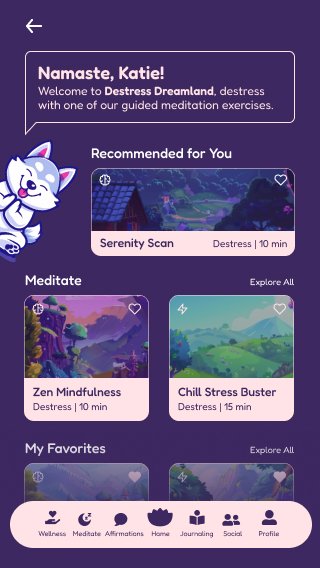
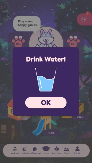
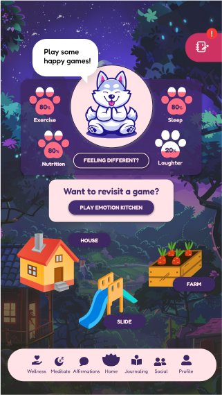
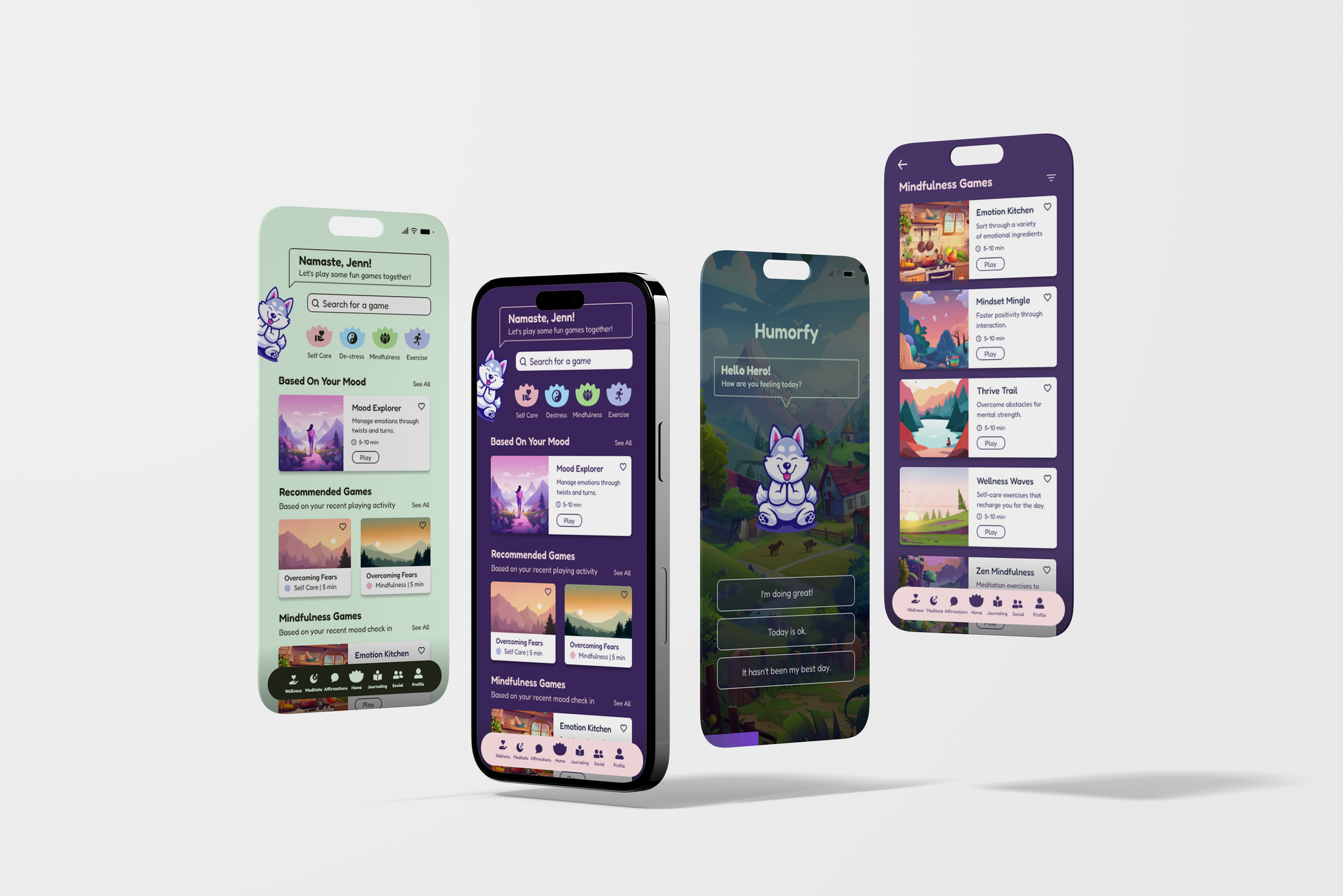
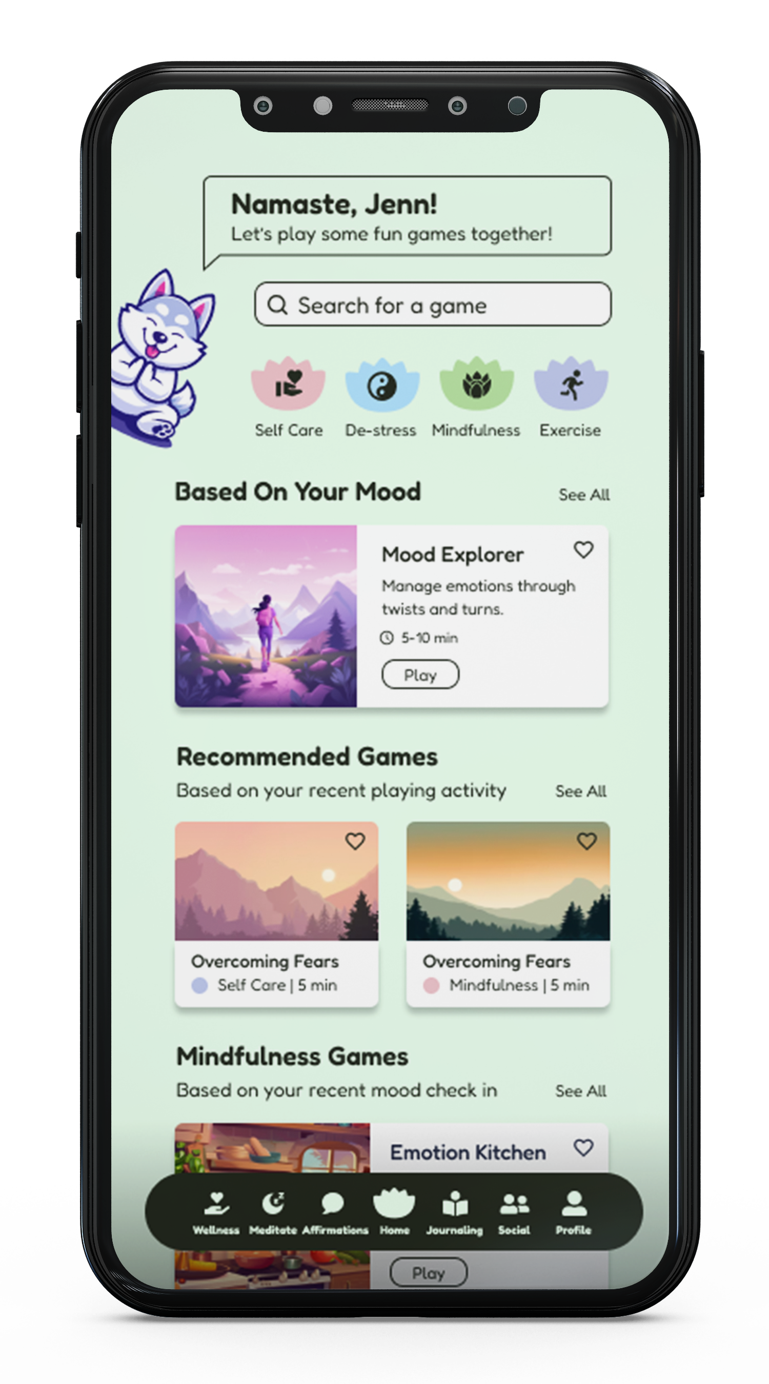
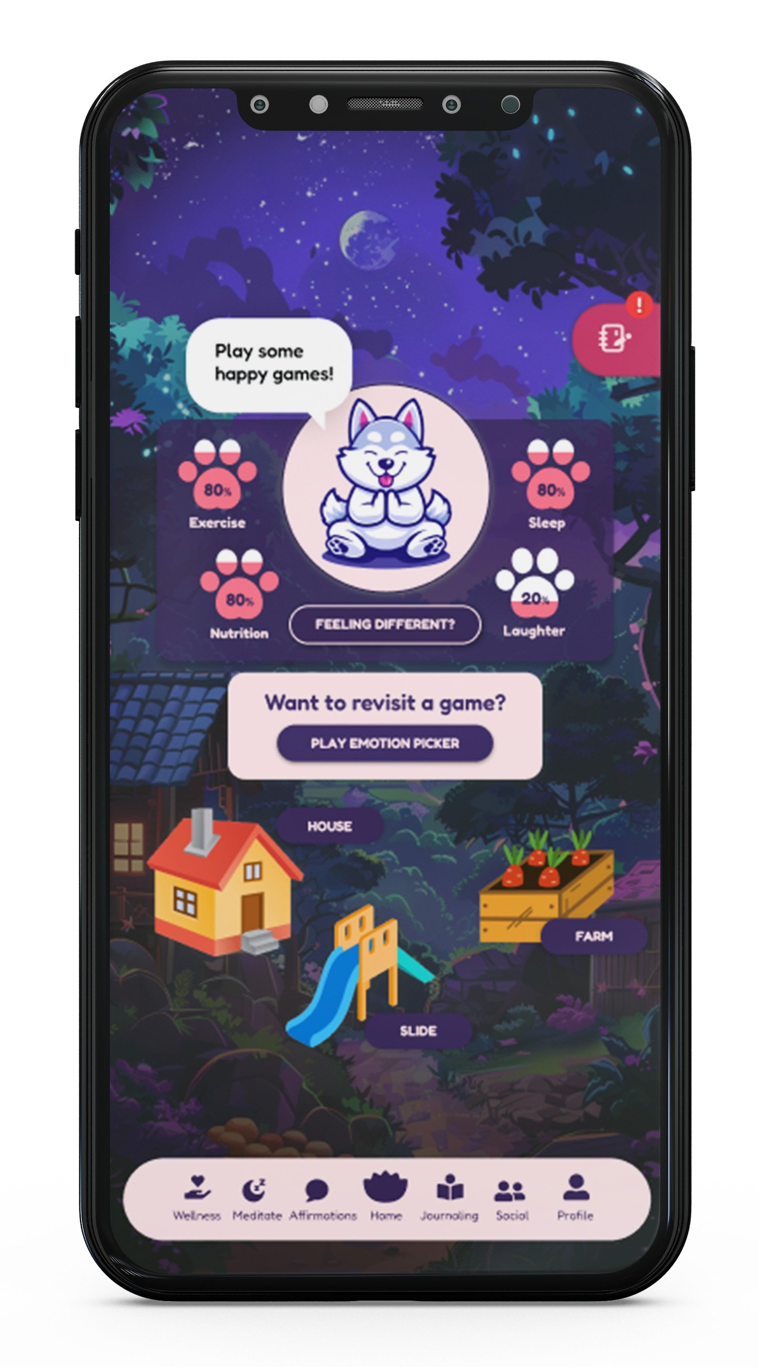
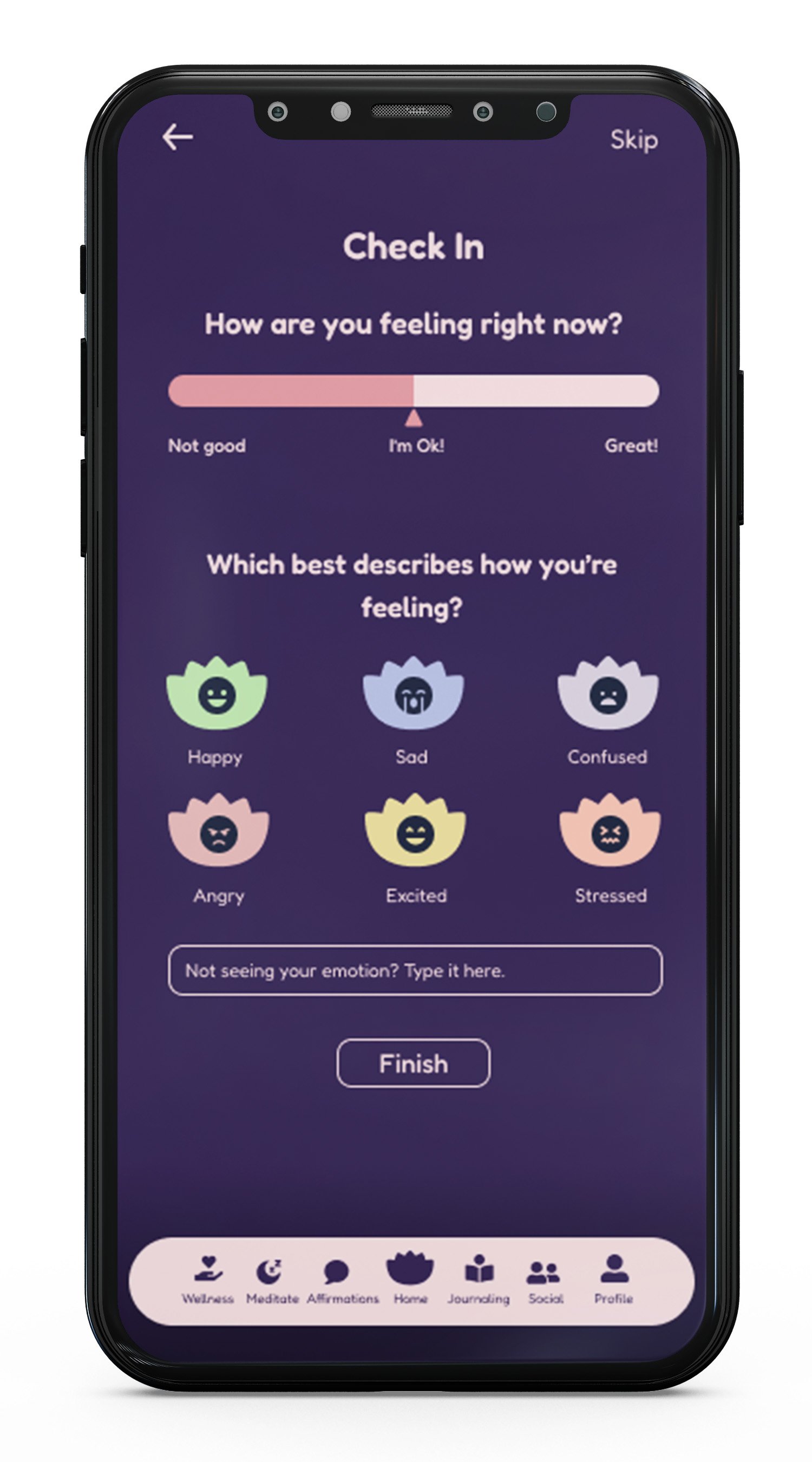
Color Palette We opted for a vibrant and cheerful color scheme, incorporating light green, purple, and pink. For night mode, we transitioned the screens to darker tones, such as deep purple contrasted with light pink text, to evoke a sense of tranquility and relaxation.
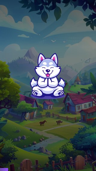
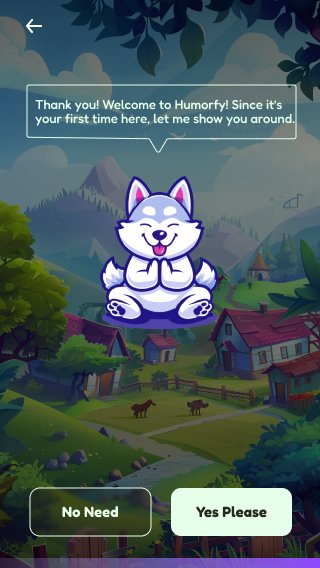
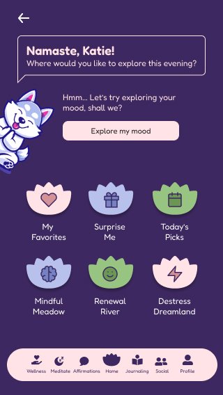
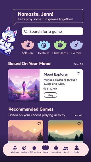
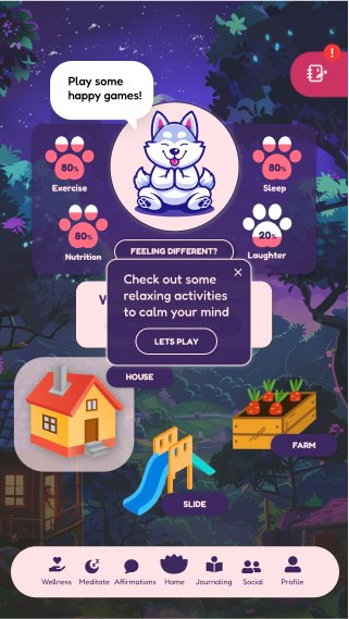
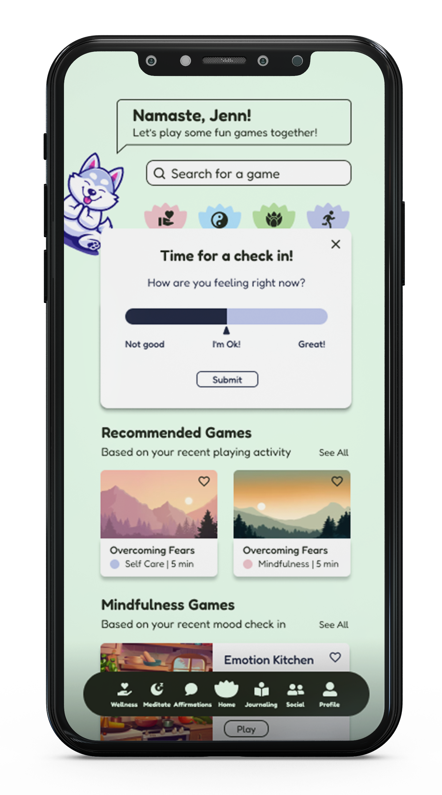
Character Design We introduced charming characters like Harley the Humor Husky and Paz the Play Pibble for key screens such as onboarding, profile, and games. These friendly guides offer interactive health tips, fostering a deeper level of user engagement and connection.
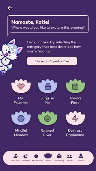
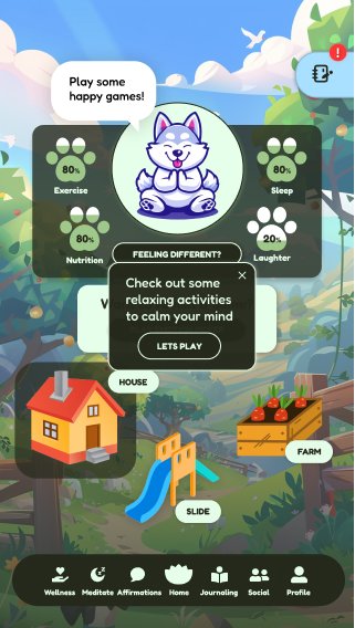
Interface Elements We implemented rounded buttons to complement the friendly and welcoming atmosphere of the app. Lotus-shaped buttons and icons, symbolizing growth and awakening, were incorporated. Avatars with text bubbles conveyed meaningful messages, adding a playful touch to the user experience.
Designed low-fidelity screens to layout our initial ideas
Ideation
Implementation
In the mid-fidelity stage, we implemented our design system
Prototyping
Using the design system as a foundation, we developed high-fidelity prototypes that embodied the app's playful and engaging nature. Interactive elements, such as characters popping up with health tips and animations reflecting the user's health status, were incorporated.
We created interactive mockups by linking different frames together, simulating user flows and interactions. Our focus was on linking buttons to help navigate through the screens seamlessly.
Refinement
The refinement process from mid-fidelity to high-fidelity involved enhancing visual elements, refining interactions, and adding detailed design elements to create a polished and finalized user interface. We addressed inconsistencies, such as ensuring the back button was in the same spot on all screens, proper color usage, appropriate spacing between elements, and consistent navigation bar placement. Additionally, A/B testing prompted us to refine the use of color contrast, alternative text descriptions, and keyboard navigation compatibility. Dedication to inclusive design ensured a seamless and enjoyable experience for users with varying visual abilities.
User Testing (A/B Testing)
To validate design decisions and enhance user experience, we conducted A/B testing among a group of students on our mid-fidelity designs. Here are some of the key findings collected from our user testing:
Embracing Minimalism Our users had a distinct preference for streamlined interfaces, advocating for designs that prioritize clarity and minimize visual clutter.
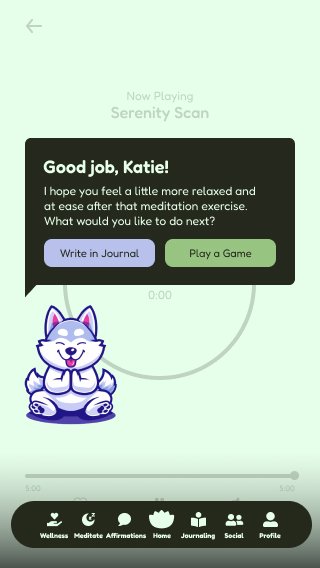
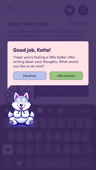
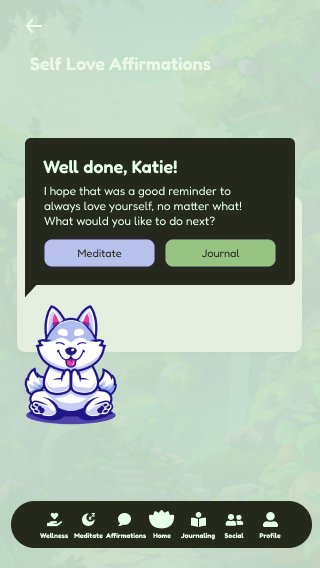
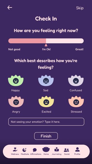
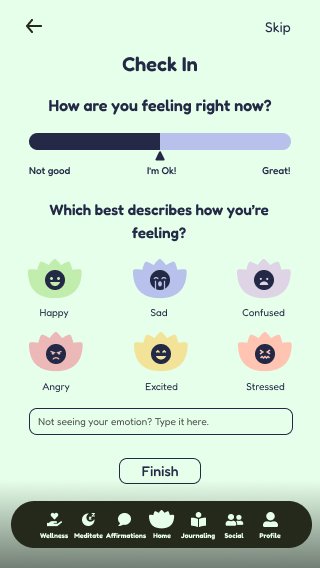
Emotional Check-Ins Users appreciated the check-in screen that showed up after completing a game. This interactive element not only facilitates debriefing but also fosters emotional engagement, allowing users to maintain a deeper connection with their gaming experience.
Avatar Interactions The inclusion of the playful husky avatar received diverse reactions from our users. While some found its presence charming and interactive, others perceived it as unnecessary and disruptive from the overall user experience. Balancing such elements requires careful consideration to ensure they seamlessly integrate with the interface while enhancing user engagement.
Navigational Complexity Feedback regarding the navigation bar highlighted various challenges with its complexity. Users expressed frustration with the abundance of options, leading to confusion and a prolonged decision-making process. Streamlining the navigation experience is critical for enhancing usability and user interactions.
Dynamic Color Schemes Users also had mixed feelings regarding the overall color schemes for both day and night modes. While some users appreciated the vibrancy and playfulness, others voiced concerns that the colors appeared childish, detracting from the app’s intended purpose.
Reiteration
With solid mid-fidelity prototypes, weeks 5-9 were spent refining our designs into polished high-fidelity screens. We focused on design features, color, and overall theming, ensuring cohesion with the app's design style. This process involved continuous communication with the client and the entire team to ensure our work reflected the client's vision.
Final Designs
All screen designs located at the bottom of this case study
Challenges & Lessons
Throughout the project, we faced several challenges:
Balancing Playfulness and Maturity Achieving a design that appealed both visually and functionally to a broad demographic was challenging. Through iterative design and testing, we learned the importance of flexibility in visual elements and narratives.
Client Collaboration Regular standups and the use of Midjourney AI as a collaborative tool were pivotal in aligning our vision with the client's expectations, showcasing the value of visual mockups in client-designer communication.
Technicality The client's lack of technical skills in UI/UX design posed a challenge in communicating design concepts, user flows, and interactive elements. To overcome this, we adopted a hands-on approach, creating multiple iterations of the Figma prototype and presenting them to the client, explaining the design rationale and functionality.
Compromises Balancing the integration of humor without compromising the app's usability required extensive brainstorming and user testing. Striking this delicate balance took several back-and-forths with the client until we understood her vision for "Humorfy."
We learned valuable lessons throughout the project, such as being flexible with our designs, focusing on basic general layouts before diving into mid-fidelity and high-fidelity, and heavily considering the client's opinions through deep collaboration.
Client Testimonial
"Our journey with the team was transformative. The Midjourney AI mockups were a game-changer, helping us visualize and refine our vision into something truly special. The app has begun to reshape how our users engage with health and wellness, and it's all thanks to the team's dedication and innovative approach."
As the project evolves, our client is eager to continue leveraging our expertise to enhance the application's features and user experience. This continued partnership will allow us to contribute further to refining and expanding the application's capabilities, ensuring it meets the client's evolving needs and expectations.
Links
Figma - Prototype
Medium - Case Study
What’s Next
Building on the success of the initial launch, we plan to expand the app's features, incorporating more interactive games and social networking capabilities to enhance community engagement and support. Our client was pleased with the work and mentioned continuing the collaboration with Cal Poly Iter8 as the application develops further.
We're excited about the future of Humorfy and the impact it will have on making health and wellness a joyful part of everyday life. Thank you for joining us on this journey.
Cal Poly Iter8 | Humorfy Team | Winter Quarter 2024
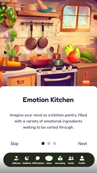
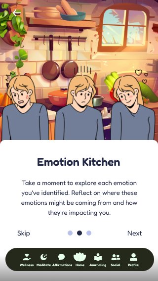
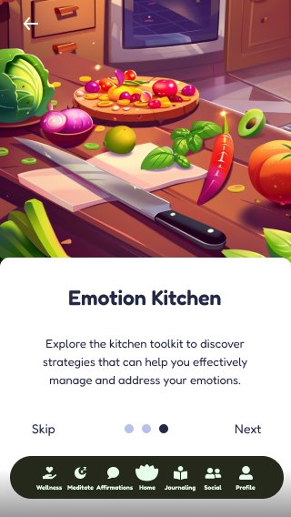
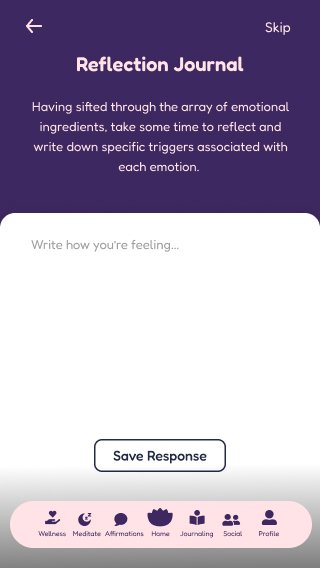
Walk-through the Humorfy experience with each screen design below.
Humorfy Experience
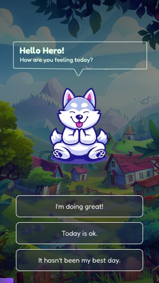
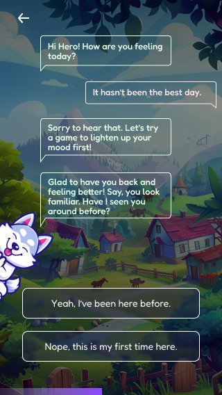
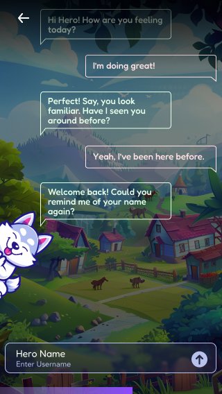
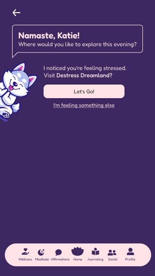
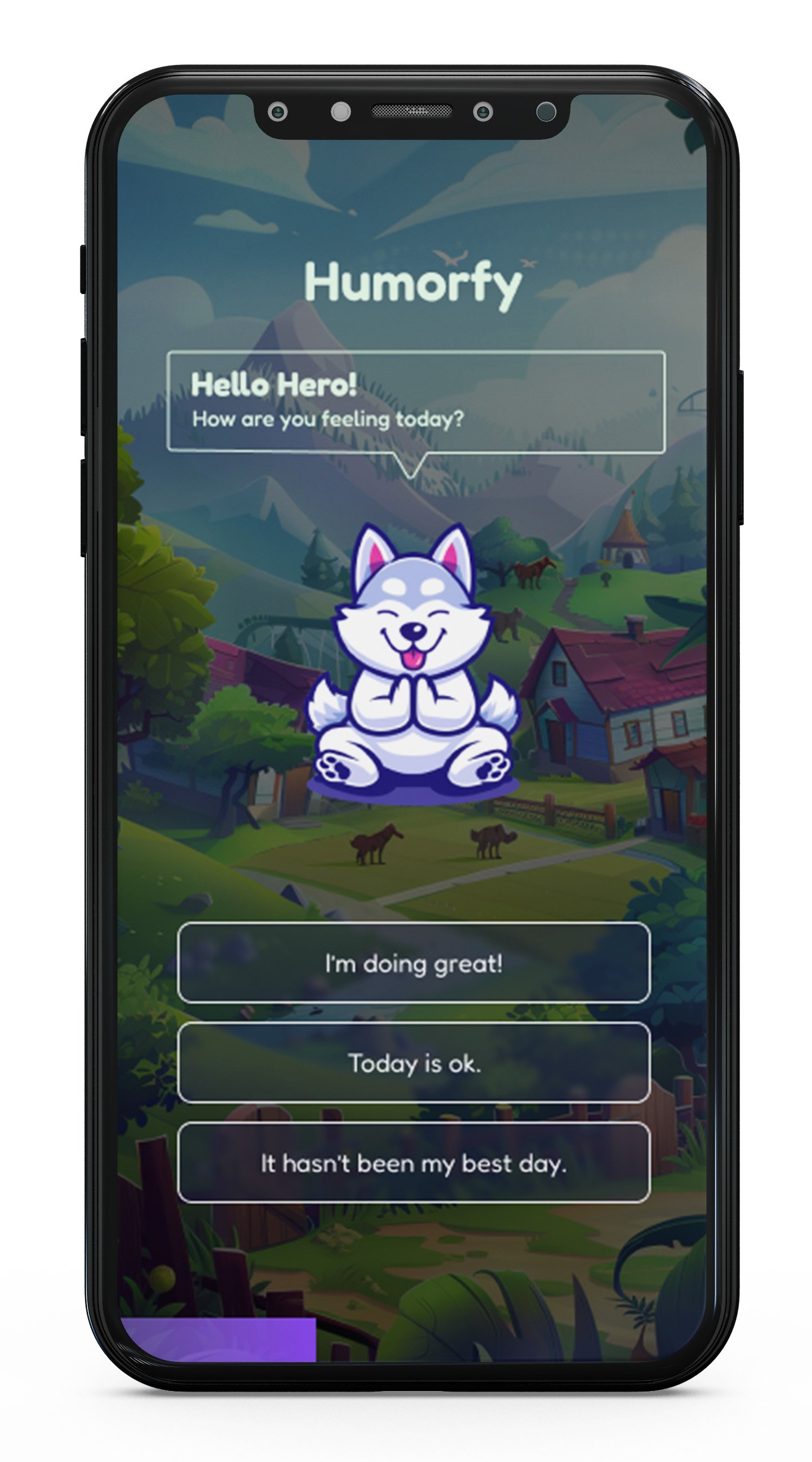
How are you feeling today?
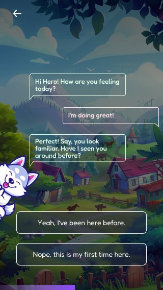
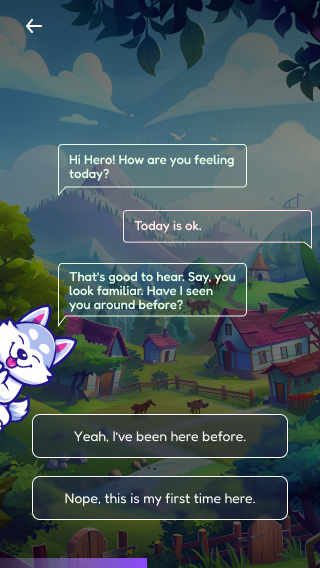
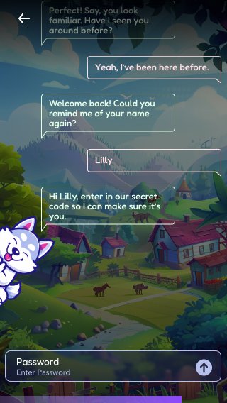
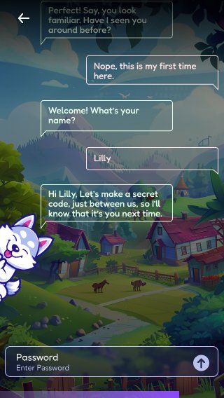
Have you tried out Humorfy before?
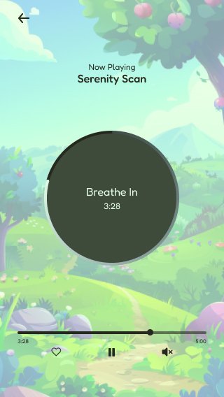
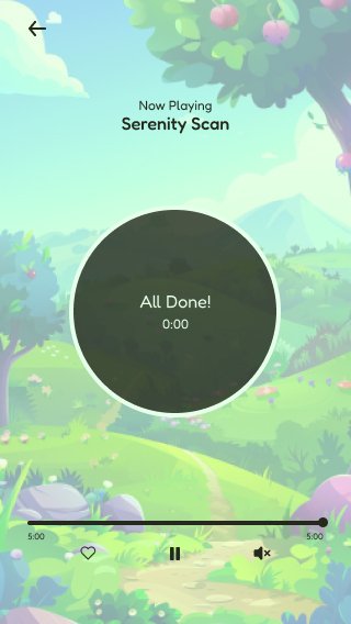
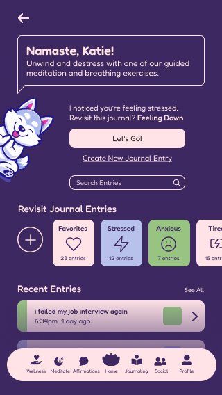
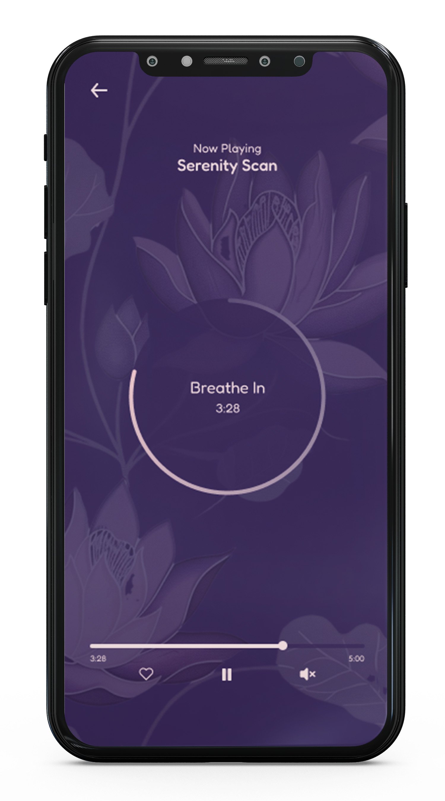
Try our guided meditation exercises!
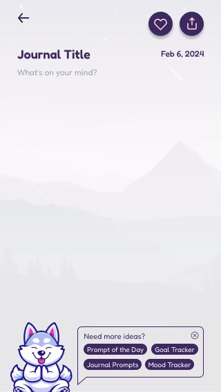
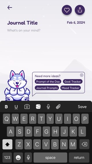
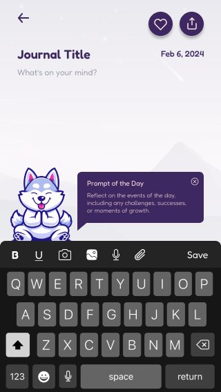
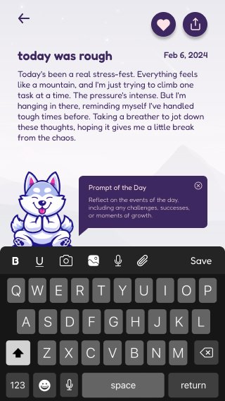
What's on your mind? Type it out in your personal journal.
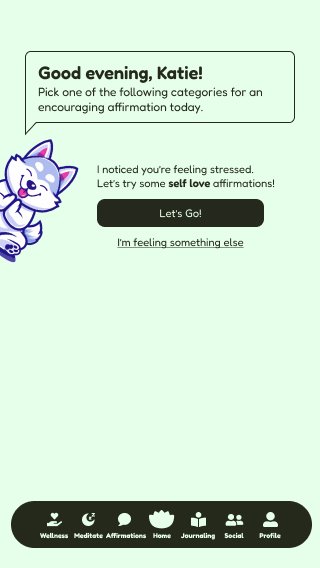
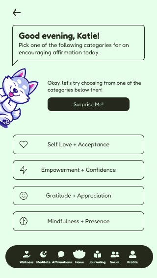
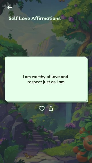
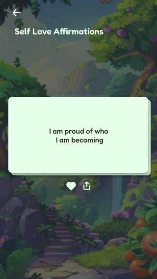
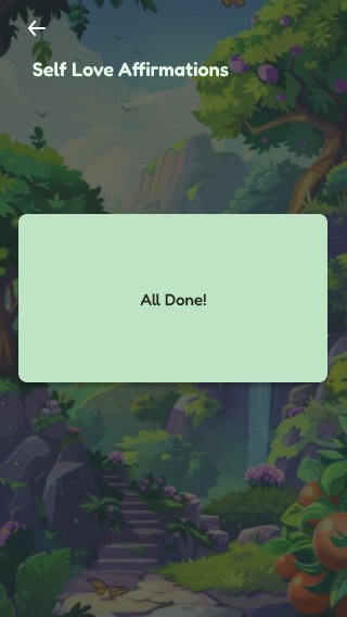
Let's practice some encouraging affirmations today.
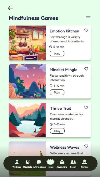
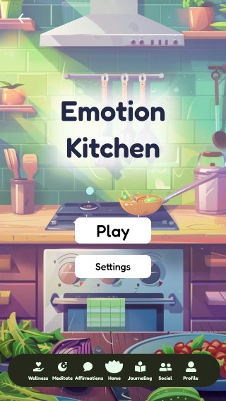
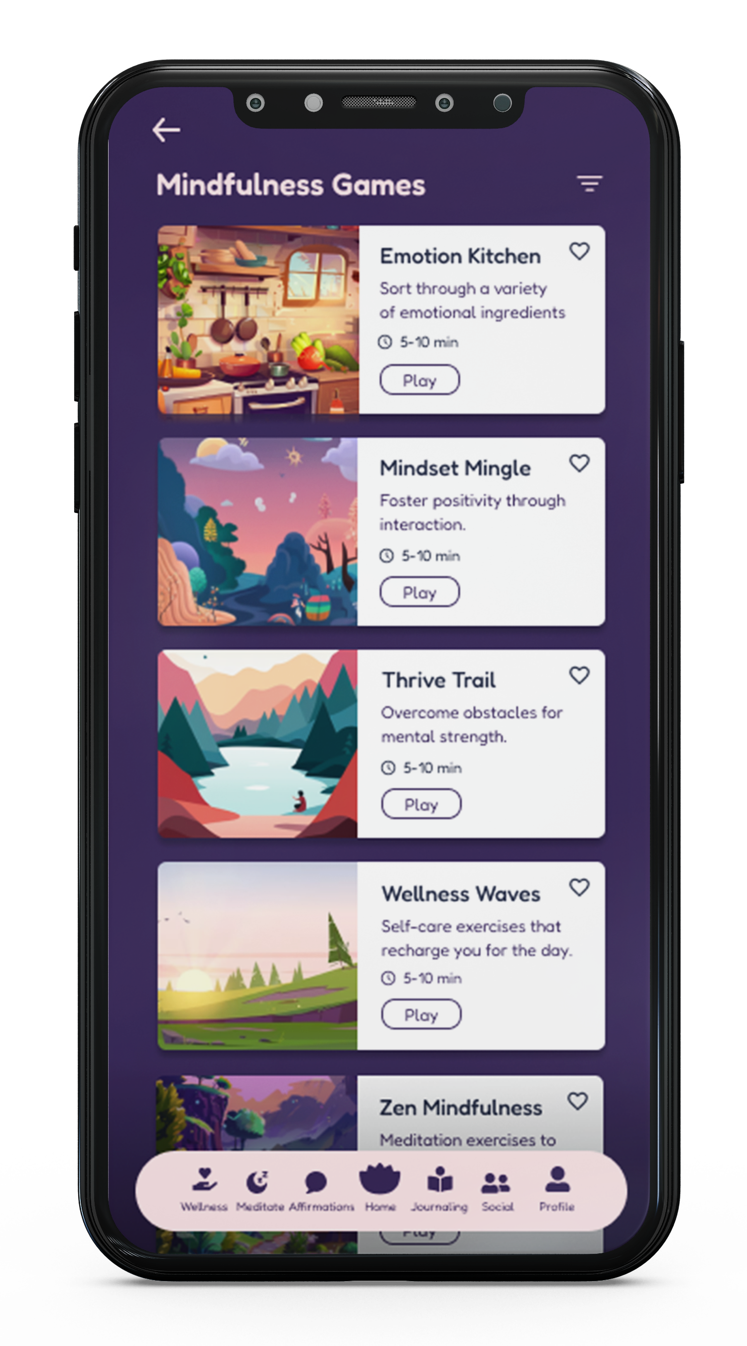
Explore some helpful games!
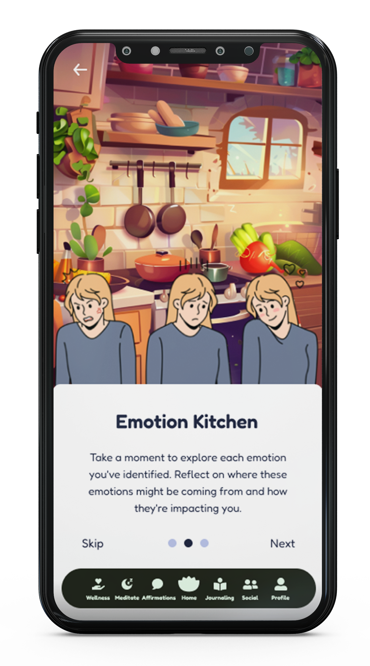
After playing a few games, we'll check in with you to reflect on your experience.
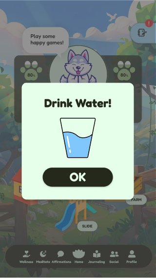
Play a few more games that practice good habits, like drinking water!
Check out your profile and navigate through your activity, community, and resources.
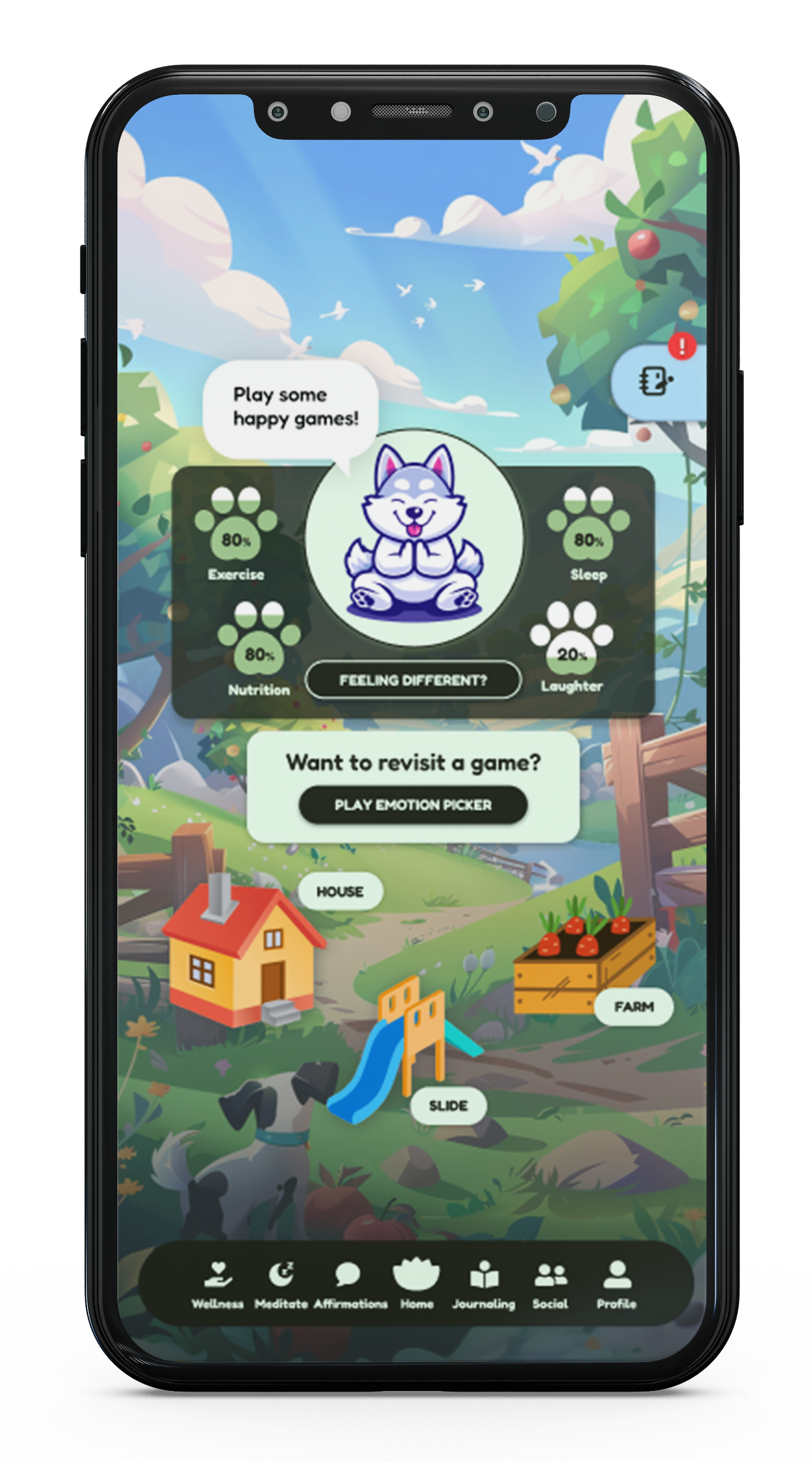
Edit and share your profile. Access your settings and privacy...in Light Mode!
Edit and share your profile. Access your settings and privacy...in Night Mode!
Thanks for checking out Humorfy!
Please get in contact if you have any questions or would like to learn more about this project!


